My Dream Staging Part 2
I had so much fun staging this stunning house since it was almost a blank canvas. The homeowner had already moved out but left a few pieces of furniture for me to work with.
I basically had to furnish the main floor. View this link for Part 1 of this Staging. You won’t believe how great it looks.
This post is about the bedrooms upstairs.
Make the Most of What you Have:
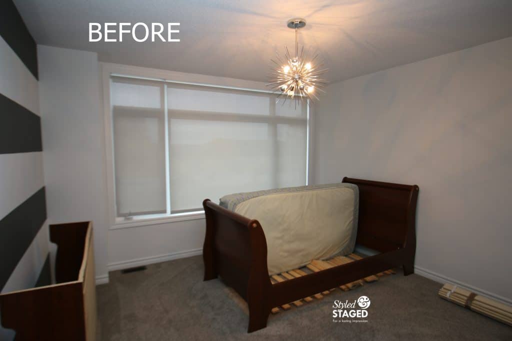
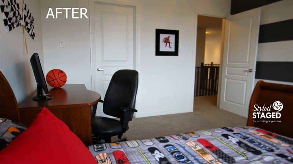
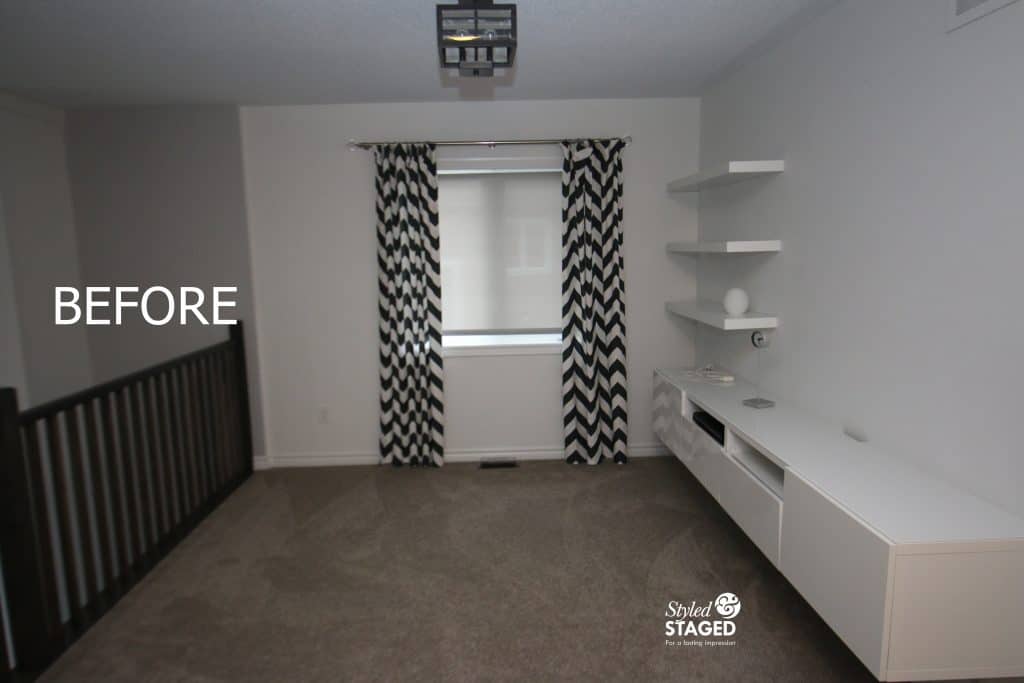
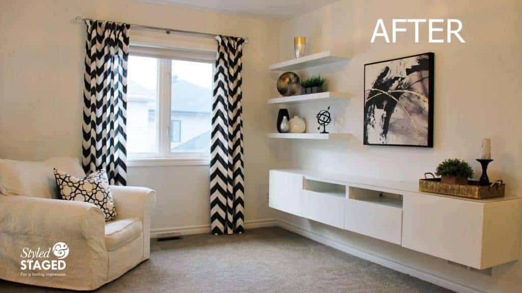
The only thing in this room was s single bed and a night table.
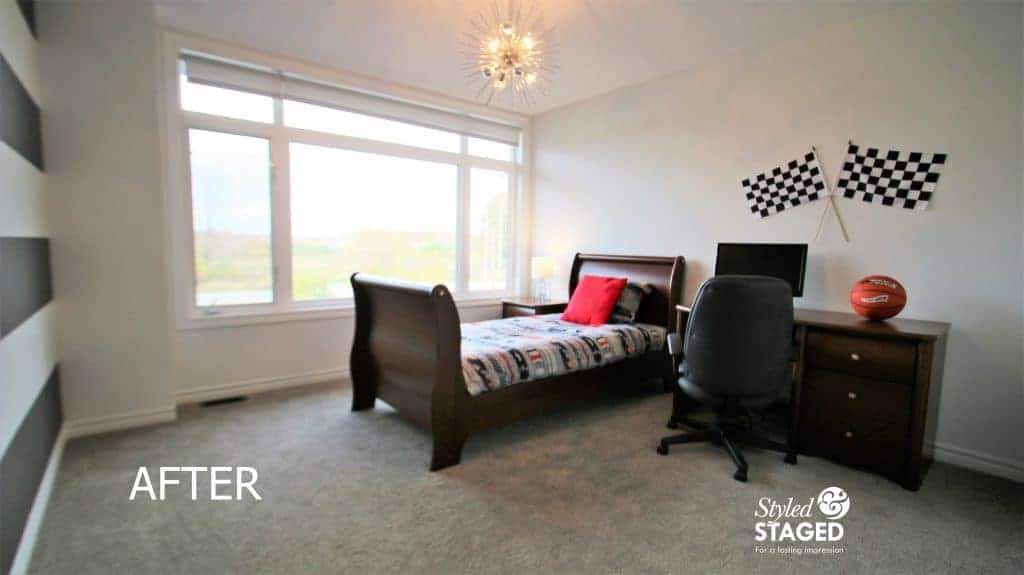
I knew there was a desk in the storage in the basement so we brought it up to help fill up the very large room and give some scale to buyers.
The bold stripe wall was my inspiration for the décor.
I brought in sporty skateboard linens. The graphic design was the perfect complement to the stripe wall. It’s hard to find artwork for teen rooms, so I printed this skateboard image from the internet and framed it in modern black frame.
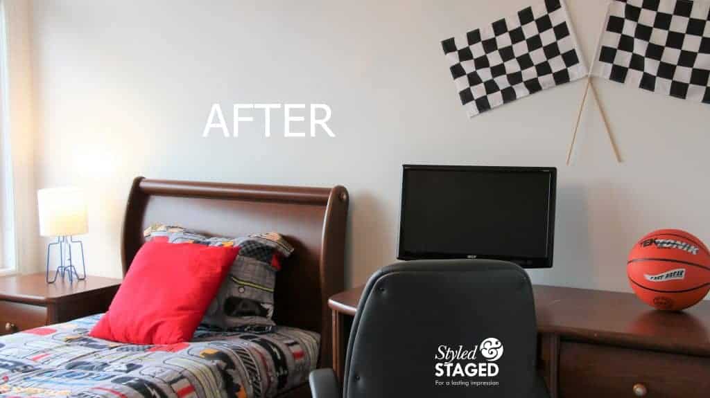
This side of the room needed some bold colours to balance the stripe wall. Hanging checkered flags keep with the sport feel.
Inspiration:
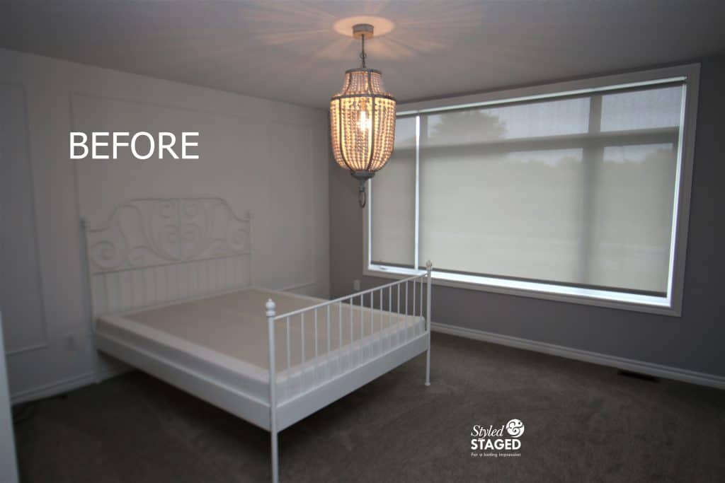
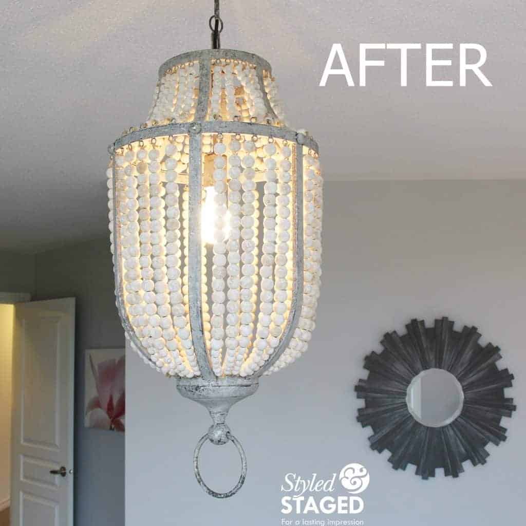
There was only a bed in this room but I was so inspired by the romantic beaded light fixture and white panelled wall behind the romantic white iron bedframe.
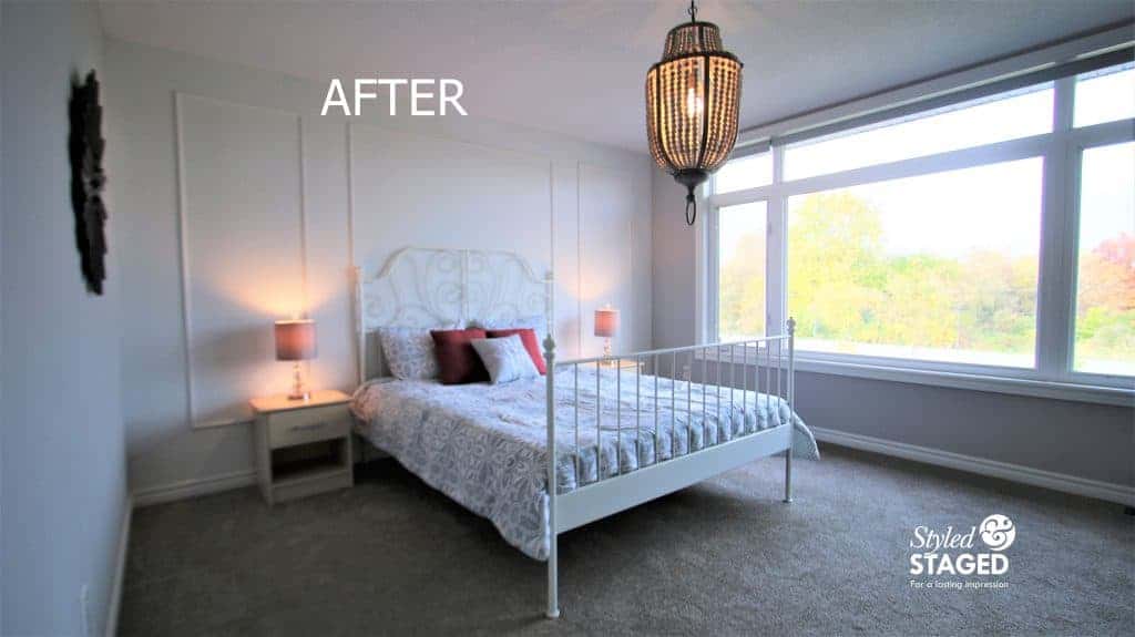
I didn’t want to add anything too bold to distract from these elements.
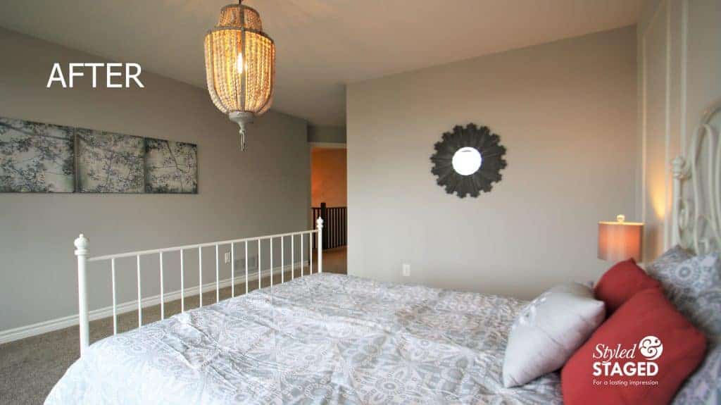 The gray and white linens were soft and tied the white wall and the gray walls together. Subtle hits of pink were drawn from the artwork. When you don’t have furniture, it’s good to hang artwork so buyers can get a sense of how large the room is.
The barnboard wood mirror was a nice substitute for additional art and it reflected the light from the window as well as adding some texture.
It’s All About The Photos:
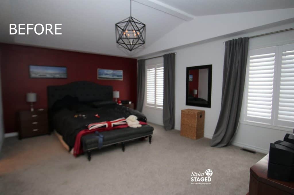
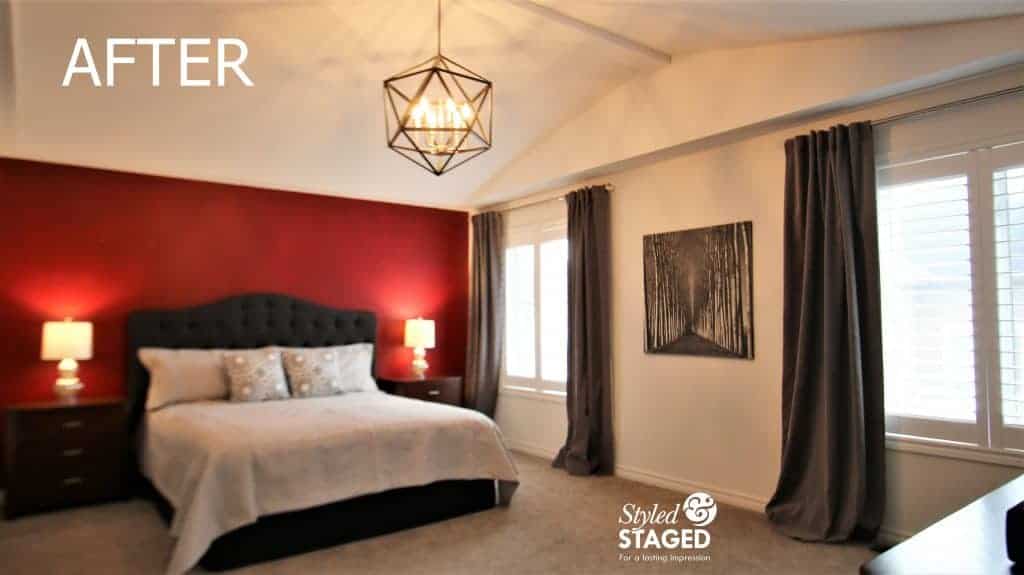
When you have dark walls with a dark headboard and dark linens the room looks too dark in photos. I’ve learned over the years what looks good in person and what looks good in photos.
As soon as I added lighter gray lines and patterned cushions the room was transformed. The bench was moved to the main floor family room as a coffee table. Notice how much softer the artwork looks compared to a mirror. Mirrors don’t always help you in photos. I also brought in sparkly mercury lamps for a bit of bling.
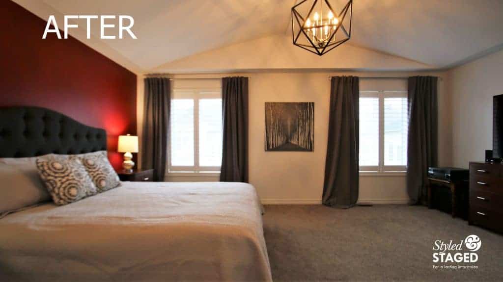
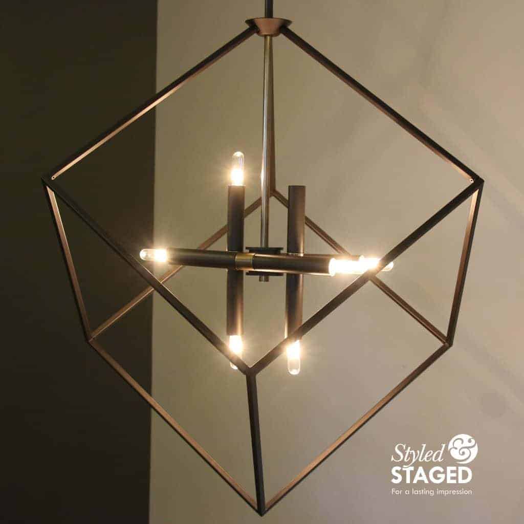
The dramatic ceiling light is now the center of attention. Buyers will love it since it stays with the house.
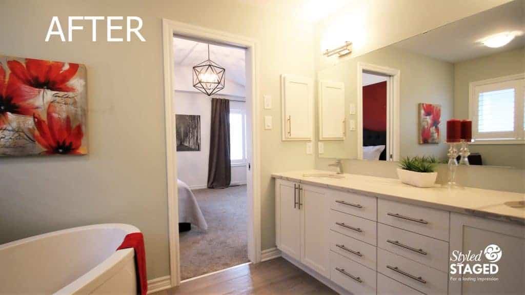
I put just enough red accessories in the bathroom to tie it in with the master bedroom.
Tie Colours Together:
Just outside the master bedroom was a loft looking over the family room. Since it was in full view of both spaces, I wanted to tie the colours together.
There was no red added, but it definitely complemented the master bedroom.
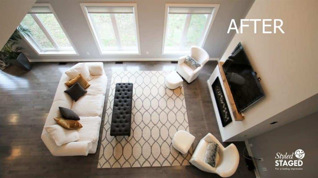
This is the view from the loft. The gold, ivory, gray, and black work so well together. Always keep your sight lines in mind when you are choosing your colour scheme.
Start with your inspiration and work from there.
Don’t forget to check out Part 1 of this house transformation.
This house received an offer in the first week on the market!